Charts, maps and infographics
Daily chart
The open society and its enemies
THE ECONOMIST: by K.N.C., G.S and R.J.
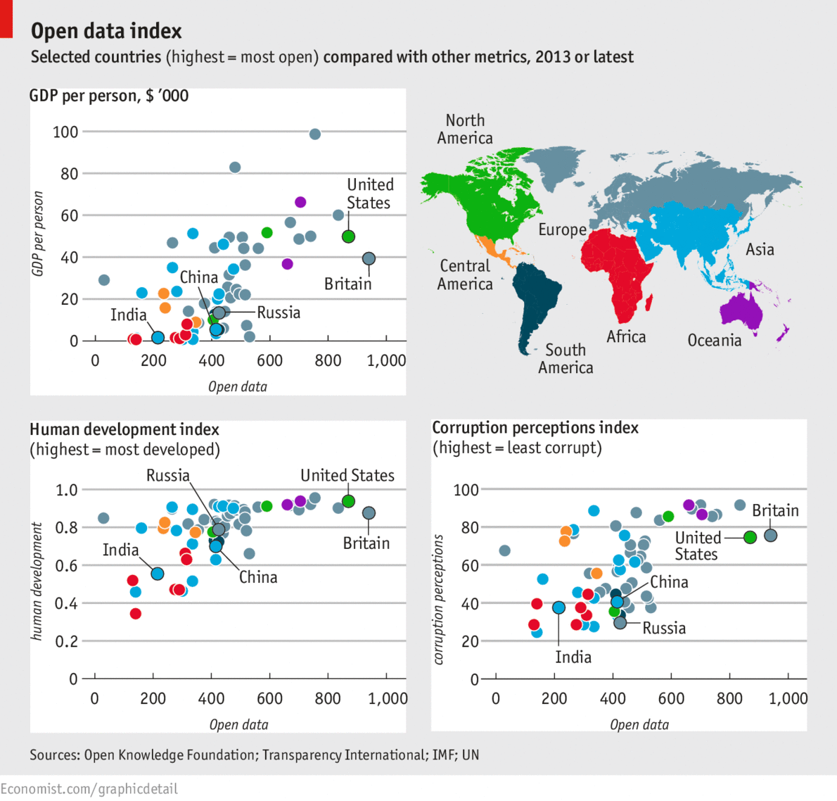
How open-data compares against other national metrics
THIS week sees a cornucopia of open-data celebrations. Britain’s Open Data Institute is announcing numerous affiliate programs around the world. The McKinsey Global Institute is publishing a much-anticipated report on open data (which it defines, controversially, to include private-sector data that can be licensed). AidData, a group that tracks charitable and governmental programs, is updating its massive database. The week is capped by an intergovernmental meeting in London called the “Open Government Partnership.” Amid all this, Britain’s Open Knowledge Foundation has inaugurated an index of the most open-data-friendly countries. Britain and America lead. Yet comparing the index against GDP, corruption perceptions (from Transparency International’s annual ranking) and the UN Human Development Index uncovers surprising findings. The clusters and outliers suggest that for middle-income countries there is a link with open-data practices, but not among the richest countries. Likewise, some of the least corrupt countries are nevertheless middling in making their data open. Together, the charts suggest there is still a long way to go to get states to release their data openly.

